


Post Content
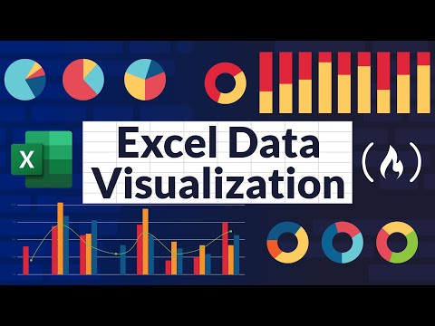
This comprehensive tutorial will teach you everything you need to know about Excel chart types, chart customization, and creating engaging Excel dashboards.
⬇️ Download course files here: https://tinyurl.com/539e2zr2
👨🏫 FREE Excel Course: https://officetechskill.com/excel-free-course/
⭐️ Chapters ⭐️
(0:00:00) Introduction
(0:01:17) Column Chart
(0:03:54) Bar Chart
(0:05:58) Line Chart
(0:07:46) Pie/Doughnut Chart
(0:09:05) XY Scatter Plot Chart
(0:10:42) Area Chart
(0:12:20) Radar Chart
(0:13:28) Stock Chart
(0:16:06) Histogram Chart
(0:18:26) Pareto Chart
(0:19:40) Waterfall Chart
(0:20:53) Box & Whisker Chart
(0:22:50) Treemap Chart
(0:24:42) Map Chart
(0:26:00) Recommended Chart
(0:26:49) Chart Customization
(0:27:27) Organize Data
(0:28:11) Choose the Best Chart Type
(0:28:30) Applying Chart Styles
(0:28:43) Adjust Chart Elements and Labels
(0:29:08) Enhancing Data Label and Gridlines
(0:29:33) Applying Color Themes and Palettes
(0:30:14) Utilizing Combination Chart and Secondary Axis
(0:30:51) Incorporate Trendlines
(0:31:30) Applying Chart Elements
(0:31:43) Best Practices for Chart Customization
(0:32:29) Excel Dashboard
(0:33:13) Interactive Dashboard
(0:33:34) Plan Your Excel Dashboard
(0:34:23) Clean Data
(0:43:13) Building Relationships
(0:46:11) Writing DAX
(0:48:43) Building Pivot Table
(0:51:59) Building Charts
(0:57:16) Building KPIs
(1:01:06) Incorporate Interactivity
(1:05:04) Building Dashboard
(1:09:55) Free Excel Course Read More freeCodeCamp.org
#programming #freecodecamp #learn #learncode #learncoding
![Learn Chess and Become a Better Developer with Ihechikara Abba (ELO rating of 2285) [Podcast #189]](https://i2.ytimg.com/vi/MiGXhDvuvEg/hqdefault.jpg)


+ There are no comments
Add yours